

Software demo automation playbook
Interactive and self-guided demos can run around the clock. But they only help when they answer the question the buyer has at that stage. Here are ten steps to build demos that sell.
- SaaS businessesRefine how you present your software in a crowded digital market.
- Marketing and sales teamsAlign on product experiences that work through your website.
- Presales and solution engineersLet buyers discover the value on their own, so your team can spend time on the deeper conversations.
Build automated demos that sell
Buying behavior has changed significantly over the past few years. Potential customers expect instant access to information and prefer exploring solutions on their own terms. Buyers research independently and spend little time interacting with vendors and sales. An automated, interactive demo tour on your website is one way to meet those expectations and offer a more frictionless buying experience.
Immediate, interactive access to your product is only as good as its design and execution. A poorly crafted demo can do more harm than good, misleading or frustrating the people it was built for.
This guide covers best practices for compelling, automated demos that engage buyers and represent your software accurately. We will explore:
- Strategic design: craft demos that are intuitive, informative and aligned with the user's needs.
- Avoiding common pitfalls: see the errors that turn an automated demo into an obstacle rather than an asset.
- Personalization and engagement: tailor demos to different personas, so every interaction feels relevant.
Offering a Full-Screen View
How you show your product matters as much as the product itself. Going full-screen is not just a style choice. It decides how well people can see what your software does.
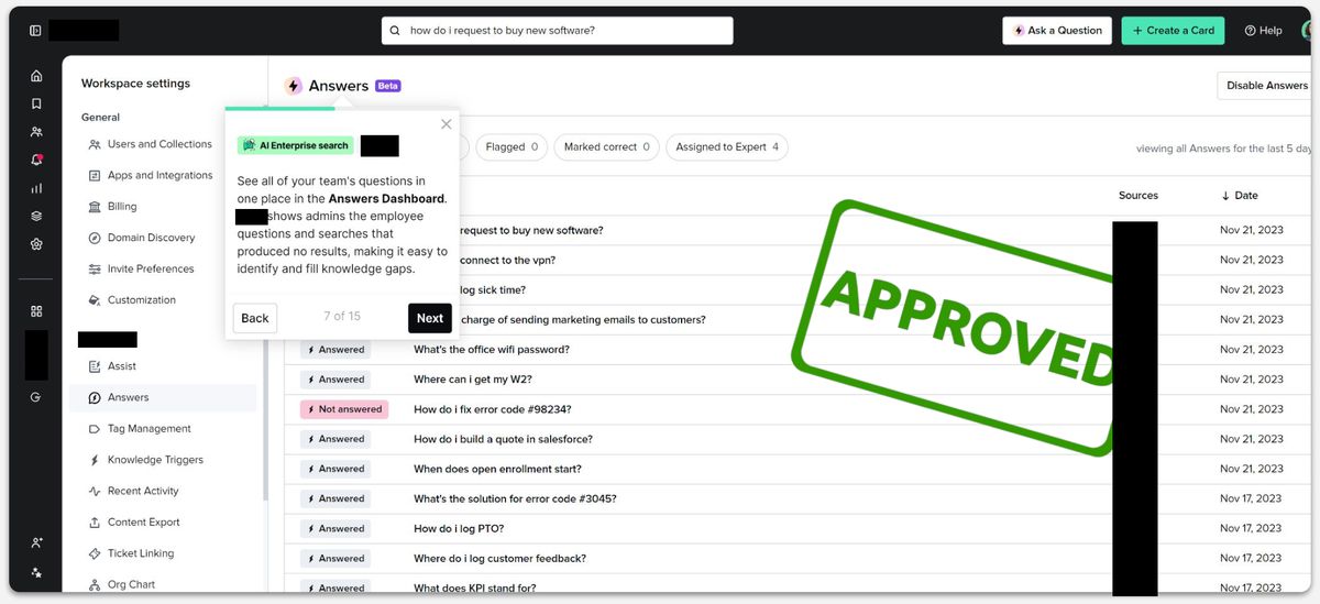
- Don’t
- Squeeze the demo into a small window. It is hard to read, people scroll a lot, and they miss key parts of the interface. That creates frustration, not confidence.
- Do
- Show the demo full-screen, like a real tour of the product. Buyers see exactly how they would use it, and that builds trust from the first click.
Why it matters
- Realism and trust: Buyers can picture themselves using the product as it is meant to be used.
- Clarity: Without a small window in the way, the layout, the workflows and the key features are easy to see.
- First impressions: A small window can make a great product look weak.
Extra tips
- Check every screen size: Make sure the demo works on laptops and tablets too.
Leading with a Clear Problem Statement
How you start decides how much people listen. Begin with the problem, so every screen that follows has a reason to be there.
- Don’t
- Jump straight into features. Talk about what the software does before explaining the problem it solves.
- Do
- Open with the problem your buyer has. Use the words they would use to describe it. Then show how your product solves it.
Why it matters
- It feels relevant: Buyers see that you understand their world before you show any product.
- It focuses on them: The demo is about their success, not a list of technical features.
- It tells a story: You move from a familiar problem to a clear result.
Examples
- Weak opening
- "Our platform has a powerful data analytics engine."
- Better opening
- "Do you miss important campaign insights because your data is spread across spreadsheets and dashboards?"
Extra tips
- Use their words: Repeat the way your buyers describe their problem. It helps them feel understood.
- Ask a question: A good question puts the problem in focus, for example: "Do you spend more time finding data than using it?"
Try itWhat problem are you solving here?
Back to the topBreaking It Down into Targeted Micro Demos
One demo for everyone rarely works. Buyers have different needs. Short, focused demos work better, because each one answers one question.
- Don’t
- Put everything into one long demo that tries to cover every buyer. People lose focus, and the message gets lost.
- Do
- Build a short demo for each problem your buyers have. Each one should show one clear way your product helps.
Why it matters
- It fits the visitor: People watch the demo that matches their problem and skip the rest.
- The message is clear: One problem, one story. Nothing distracts from the point.
- It is easy to remember: Short demos stick. Long tours blur together.
Examples
- Instead of one "Complete Product Demo"
- Try demos like "Simplify campaign reporting in under 5 minutes", "Cut onboarding time and reduce churn" or "Get better sales insights from your data".
Extra tips
- Name them by problem: Give each demo a clear title on your website, so visitors can find the one they need. Write about problems, not features.
Try itClear problem statements matter most.
Back to the topFraming Your Demo Around Value, Not Just Features
A demo is not only about what your product can do. It is about how it helps your customer.
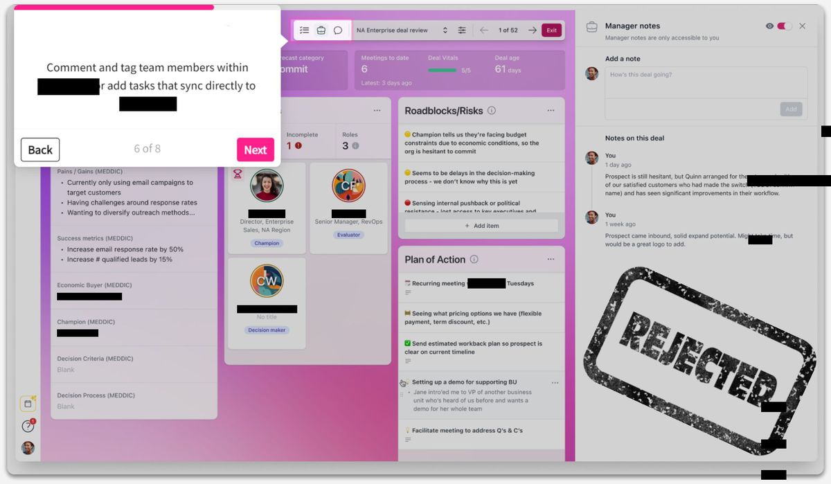
- Don’t
- Let technical details take over. Features matter, but a feature without a clear benefit does not mean much to the buyer.
- Do
- Explain what a feature does for the buyer. Say "this is what the feature does for you", not only "this is what you can do with it". Link each feature to a result they want.
Why it matters
- It matters to them: Buyers care about their goals. Show how your product helps them reach those goals.
- It is easier to understand: When a feature is linked to a benefit, buyers see how it fits into their day.
- It keeps them interested: Buyers ask "what's in it for me?" Answer that question and they stay engaged.
Examples
- Weak phrasing
- "You can build reports easily with drag and drop."
- Better phrasing
- "With our drag-and-drop report builder you don't need to code. Build the reports you need in half the time."
Extra tips
- Use their language: Use the terms your buyers use for their challenges.
- Use numbers: "Save 3 hours a week" is clearer than "save time". "Increase conversions by 15%" is clearer than "improve efficiency".
Try itSay "this is what you can do with X" instead of "this is what X can do for you".
Back to the topChoosing a Compelling Starting Point
The first screen decides whether people keep watching. Start where the value is, not at the beginning of the product.
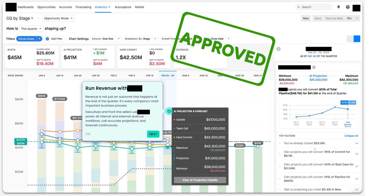
- Don’t
- Start with the login screen or a general product overview. These steps slow things down and delay the benefit.
- Do
- Start with the screen that shows how you solve the buyer's problem. Get to the point quickly, without a long click path first.
Why it matters
- It grabs attention: People have little patience. Show the link to their problem right away.
- It creates an aha moment: When people see the result early, they want to see more.
- It stays on track: A strong start keeps the demo focused on the problem.
Examples
- Weak starting point
- The product homepage or a list of features.
- Better starting point
- A short recording of a customer who has finished onboarding in minutes. It shows the result and makes people curious about how it works.
Extra tips
- Add a short teaser: One sentence before the demo sets it up: "Is slow onboarding costing you customers? See how our solution gets new clients running in record time."
Try itStart with the full forecast and the final numbers.
Back to the topAvoiding Feature-Driven Demos
It is tempting to show every impressive feature. But a feature list can work against you. It makes people compare checklists, and then price becomes the main question.
Build the demo around your buyer's problems. Then the conversation is about the results they want.
- Don’t
- List features one after another without saying how each one helps.
- Do
- For each feature, name the problem it solves and the benefit it brings. Connect every part of the demo to a result for the customer.
Why it matters
- It is more relevant: Buyers see that you understand their problem. They don't see a sales pitch.
- It is about value, not price: People understand what they get, and whether it is worth the cost.
- It sticks: People remember stories about solving problems. A feature list is forgotten fast.
Examples
- Weak
- Showing every menu item and where to click. That is not value. It is training, and this is not the place for it.
- Better
- A demo that follows a clear story, with enough focus on the problem to make the point land.
Extra tips
- Three common traps: Comparison: a feature list turns the decision into a checklist, and price wins. Confusion: technical details rarely match the problem the buyer has. Missing point: even a great feature leaves people asking why it matters to them.
Providing Context at Any Stage
In a live demo, the presenter explains each screen. In a self-guided demo, nobody is there to do that. So the screens need to explain themselves.
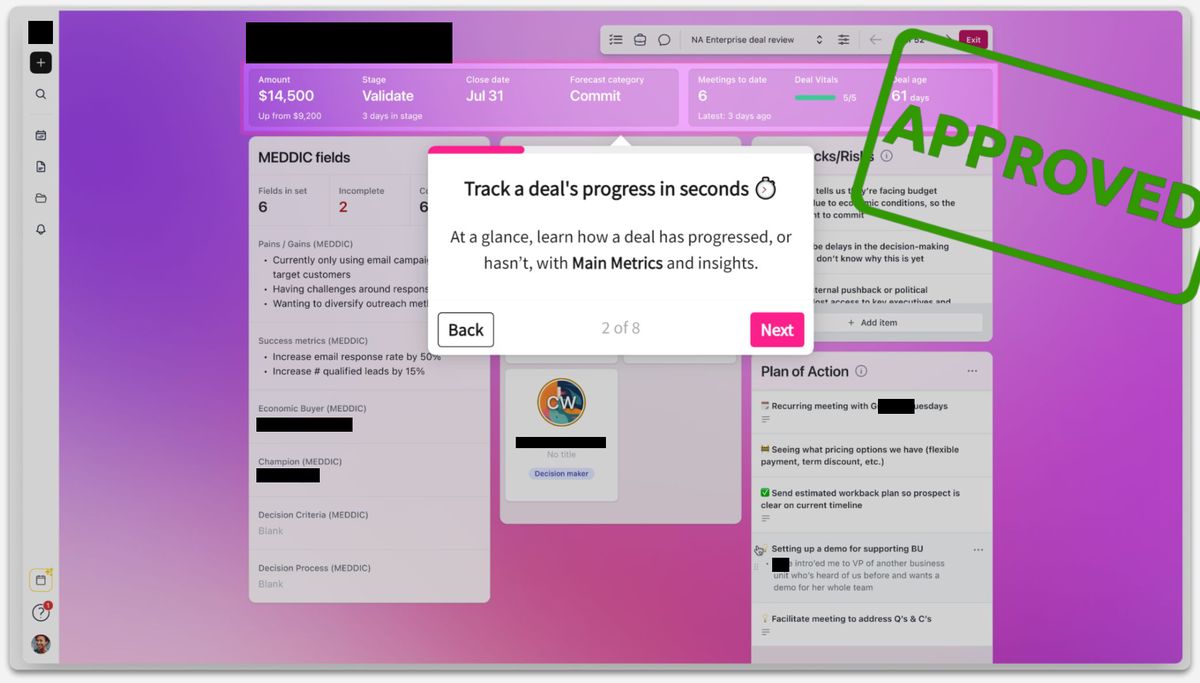
- Don’t
- Show a screen with no explanation. People feel lost and don't see why it matters.
- Do
- Add a short text or overlay at the start of each section. Say what the screen is for, how it helps with the problem, and what the buyer can do there.
Why it matters
- It removes confusion: People know why they are looking at a screen and how it fits the bigger picture.
- It keeps them on the problem: A clear explanation links every screen back to the buyer's problem.
- It keeps them interested: When people understand the point, they want to see more.
Examples
- Weak
- A screen full of customer data, with no introduction.
- Better
- A short overlay: "This dashboard shows every customer interaction in one place. Here is how to find the insights that matter."
Extra tips
- Keep it simple: Use your audience's words. Skip jargon that hides the point.
Showing the Shortest Path to Value
Automated demos often get too complicated. Buyers want things to feel simpler, not like another layer of work.
Show the shortest route to the result. Don't copy every step people take in daily use.
- Don’t
- Repeat every step of a daily workflow. It adds detail, hides how fast the value comes, and makes the product look hard to use.
- Do
- Start with the result. Then show the simplest, clearest path that gets there. Make it easy to use, and skip the long technical walkthroughs.
Why it matters
- The aha moment: When people see the result first, they want to learn how to get it.
- It feels easy: A short sequence of clear steps tells busy buyers the product is simple to use.
- It answers the fear of complexity: A short path shows that the product is not hard to learn.
- It keeps the takeaway clear: A powerful result, reached in a few steps.
Examples
- Weak
- Walking through every form field, menu and setting a new customer might see. It feels slow and overwhelming.
- Better
- Show a customer who is already set up, then the three to five steps that got them there.
Try itIf a path takes 21 steps to show a result, it's probably too long.
Back to the topCapturing Leads After Providing Value
It is tempting to ask for contact details early. But a form at the start creates friction, and many people leave.
Give people value first. They trust you more, and the leads you get are better.
- Don’t
- Put a form in front of the demo. Don't make contact details the price of entry.
- Do
- Start the demo with a clear solution to the buyer's problem. Let them have a good moment first, then ask for details.
Why it matters
- A better experience: People feel respected when they see the product before you ask for data.
- Better leads: People who have seen the benefit are happy to share their details, and they are more interested.
- Trust: Showing value first shows that you care about their success, not only about collecting leads.
Examples
- Weak
- A landing page with a long form (name, email, company, role) before the demo can be seen.
- Better
- A page that names the problem and teases the solution, with a "Start demo" button. The form comes near the end.
Try itDon't ask for contact details at the start of the tour. Most vendors ask later.
Back to the topUsing Appropriate CTAs
Too many calls to action confuse people. If the demo ends with three different asks, most people do nothing.
Choose the main goal of the demo, and make the next step obvious.
- Don’t
- Give people a list of options. Don't push "book a demo", "start a free trial" and "explore more" all at once.
- Do
- Decide the main goal of the demo. Make the call to action the natural next step for the buyer.
Why it matters
- Less friction: One clear next step is easier to follow.
- A clear goal: You know whether you want leads, trial sign-ups or booked calls.
- More conversions: When people know what to do, more of them do it.
Examples
- Weak
- "Start your free trial now!" "Book a live demo!" "Read more case studies!" all at the end of one tour. People don't know where to go.
- Better
- If the goal is leads: "See how we solved similar problems. Leave your email for a tailored walkthrough."
Extra tips
- Adjust to engagement: People who explored a lot can get a bigger step, like a live demo. People who only skimmed get a smaller one.
Try itPick the one next step that matters most for this stage.
Back to the top“If your customer hasn't recognized a problem yet, there's no point in presenting them with a solution.”Demo 101
Questions people ask
- What is software demo automation?
- Interactive, self-guided demos, like clickable product tours, that show your product without a presenter. They work best alongside live demos, not instead of them.
- Where does demo automation help?
- Early in the buying process, when people want to explore on their own, and for lots of visitors where a live demo is not practical. It also helps existing customers learn new workflows.
- Where does it backfire?
- When it is just a feature list, when it asks for contact details too early, or when a polished tour hides how complex the product is. A weak story does not get better when you automate it.
- Should automated demos replace live demos?
- No. Use live demos for discovery, questions and tailoring. Use automation to bring buyers to that conversation with a clearer view of their problem.
Automation works when the story works.
Send me one recorded demo and I will tell you honestly what to change first. Looking for the tools themselves? Compare them on the demo automation tools page.
Book a free 20-minute call